Behind the game board: Traphic (Graphic Designers)

Illustration and graphic design are communicating vessels in the Scarface 1920 project. The game’s powerful visual identity rests on two pillars: the first is Antonio Stappaerts, its illustrator, whom we met a few days ago; and the second is Traphic, an independent design studio based in Barcelona.
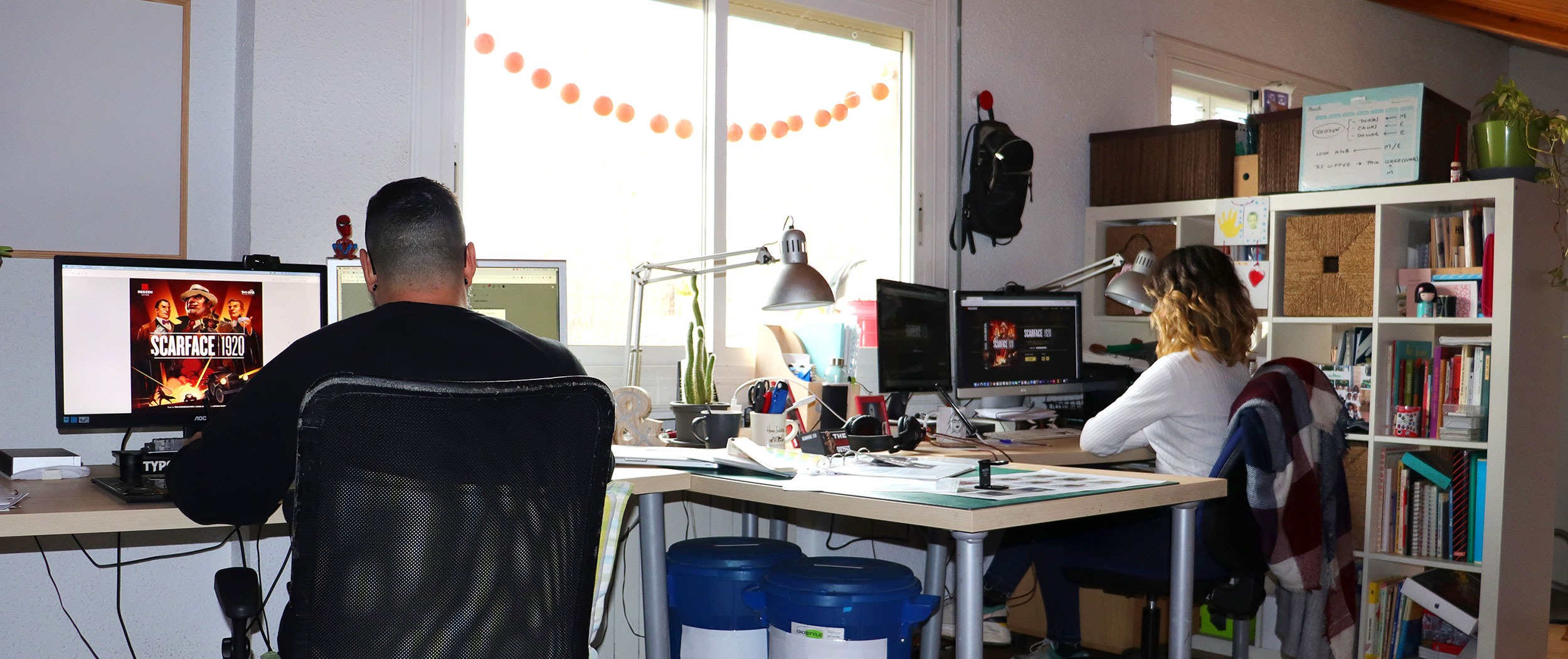
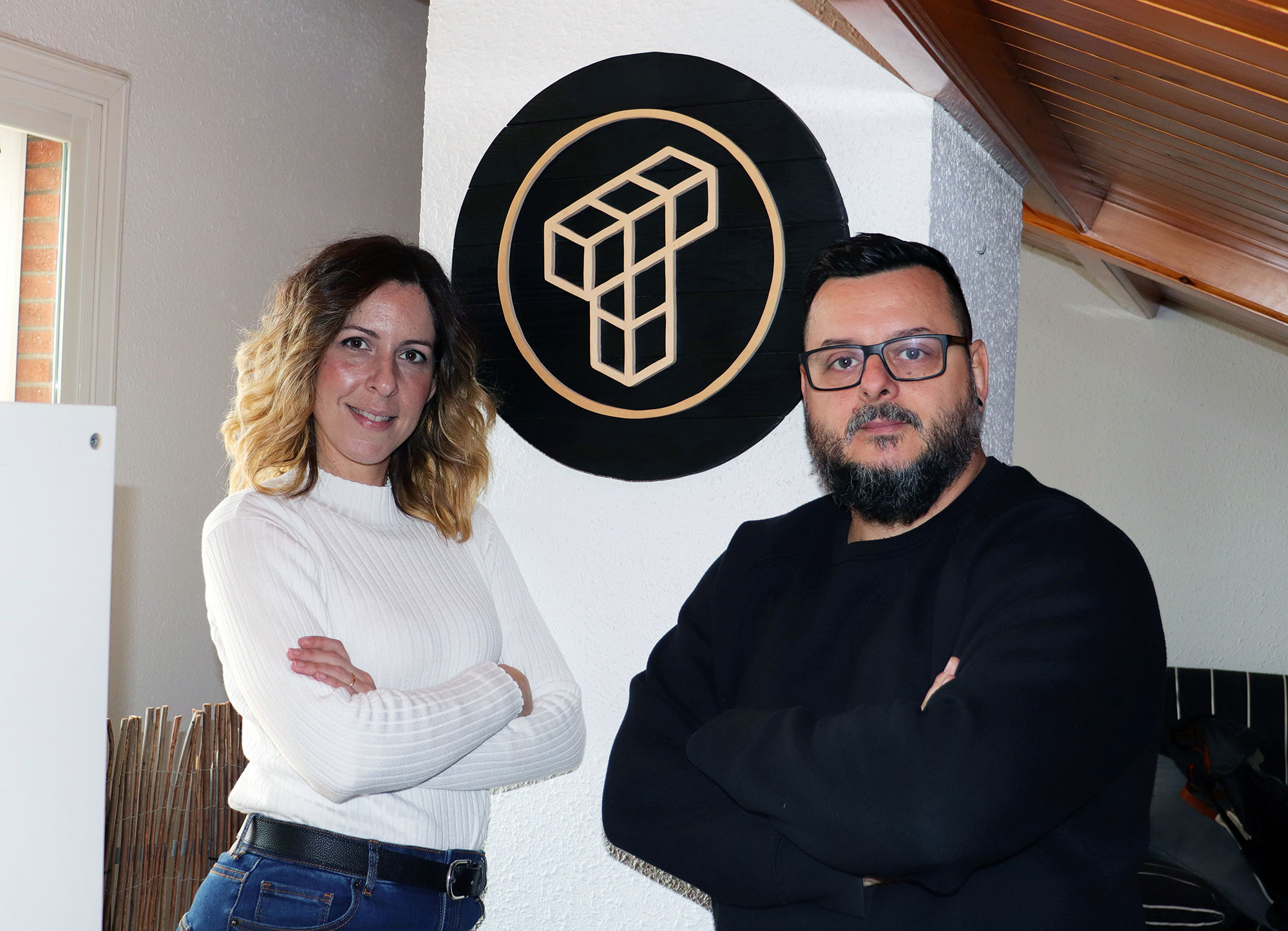
Traphic is composed by Ester Benedit and Marc Salinas, a graphic designers couple who have turned their workspace into a reduced version of 1920s Chicago: clandestine warehouses, Cadillacs, newspaper headlines on Prohibition, Fedoras and jazz. The best recipe to give Scarface 1920 personality.
For those who don’t know you yet, what does Traphic do and what is it specialized in?
Ester Benedit: Traphic is an independent design studio based in Castelldefels, very close to Barcelona. We are currently a team of three people: Marc Salinas, David Fernandez and myself. The diversity of our clients and our projects is very wide, so we can carry out works of all kinds: from corporate image or editorial design to web and App design, merchandising, illustration or corporate typography. Marc is in charge of taking the most analog part of the projects and I am in charge of controlling everything that has to do with online environments.

What is Traphic’s mission in Scarface 1920 and since when have you been involved?
Marc Salinas: The assignment seemed simple: make the graphic image of a board game set in the 1920s during Prohibition in Chicago. We have been involved in the project since January 2020… so you can imagine that nothing has been simple! Our mission is to provide the game with a graphic and visual aesthetic consistent with the era that is represented, applying quality standards that are as high as possible. The goal is for the player to have a totally immersive experience and have the feeling that he is really controlling a gang fighting for the throne in Chicago. We hope and wish we have accomplished it!
[block id=”newsletter-in-content”]
Every great design begins with an even better story, what motivated you to embark on the board game?
Ester Benedit: This project has been a real challenge for the studio. We can affirm, without a doubt, that it has been the most complex that we have done to date. Starting with the entire process of historical research, where we have entered the exciting world of prohibition in the 1920s in America (reviewing publications of the time, analyzing documentaries, watching television series, etc.), going through all the process of graphic design (sketches, tests, corrections), until reaching the graphic implementation in an infinity of pieces that make up the entire board game. Learning has been a constant. We believe that the most important motivation for this project has been to embark on a world that we were initially unaware of, board games, and of which we now consider ourselves true addicts!
They say that there is only one type of designer, which is the one who cares about typography. Marc, how and why was the font for Scarface 1920 chosen?
Marc Salinas: This project fitted like a glove, typographically speaking, for the studio. The historical theme of the game was the perfect excuse to carry out an in-depth exploration of how typography was designed and especially how it was applied at the beginning of the 20th century. Advertising, street signs, labeling of establishments or vehicles, etc. All of these elements were essential to our investigation. The typeface family we selected (Knockout) is the exact representation of the visual aesthetics of the time. Designed by type foundry Hoefler & co. in 1994. It is a historical review of the grotesque linear fonts created at the beginning of the 20th century by American type Founders, the largest sales and distribution company of lead sources in the United States.
What graphic elements, linked to Scarface 1920, is Traphic most proud of?
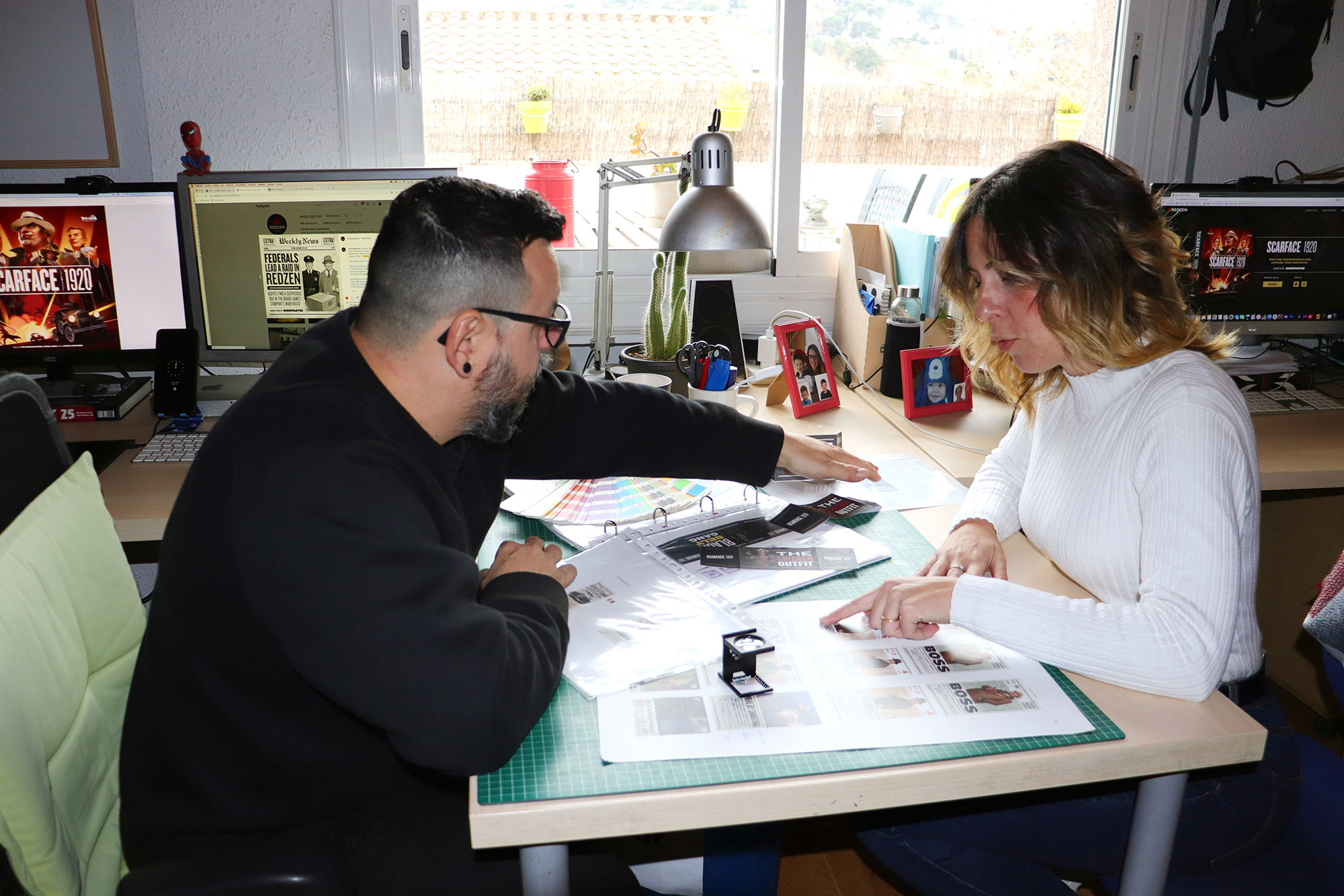
Marc Salinas: Possibly the Gangmembers and Associates cards. They are the first items in the game that we designed and the ones that we used as a graphic reference to then do all the other elements.
Ester Benedit: The board was also a really interesting piece to design. It was a very enriching and complex teamwork. The end result is amazing.

We have seen on Redzen Games Instagram that important news related to the game are being published. What is the next news that you are working on?
Ester Benedit: We have just made the reveal of the box. Perhaps the most visual and relevant piece in the game. We will reveal the different elements of the game week by week, such as the Gang Members cards, the board, etc.
And a quick test to finish:
- Favorite board game: Marc Salinas: We consider ourselves rather new to the world of board games, but thanks to this commission we have bought a large quantity of them this year. We have a 6 year old son and we have played Mysterium many times with him. Right now we are hyped with the new game in the Zombicide saga: Night of the Living Dead.
- Which movie inspired you the most to make Scarface 1920? Ester Benedit: More than a movie, a documentary series that some experts recommended and that we really enjoyed. It used to be in Netflix and it’s called Prohibition. It is a miniseries directed by Ken Burns and Lynn Novick.
- Soundtrack that you would put to the game: Marc Salinas: We don’t have a favorite soundtrack associated with the game, but if there could ever be one, we wish it was composed by John Williams or Hans Zimmer.
